WACSTYLE
Scroll
![](https://mi-kata.jp/wp-content/uploads/2022/12/WACSTYLE_01.png)
![](https://mi-kata.jp/wp-content/uploads/2022/12/WACSTYLE_02.png)
![](https://mi-kata.jp/wp-content/uploads/2022/12/WACSTYLE_03.png)
![](https://mi-kata.jp/wp-content/uploads/2022/12/WACSTYLE_04.png)
![](https://mi-kata.jp/wp-content/uploads/2022/12/WACSTYLE_05.png)
![](https://mi-kata.jp/wp-content/uploads/2022/12/WACSTYLE_06.png)
![](https://mi-kata.jp/wp-content/uploads/2022/12/WACSTYLE_07.png)
![](https://mi-kata.jp/wp-content/uploads/2022/12/WACSTYLE_08.png)
![](https://mi-kata.jp/wp-content/uploads/2022/12/WACSTYLE_09-1.png)
![](https://mi-kata.jp/wp-content/uploads/2022/12/WACSTYLE_10.png)
![](https://mi-kata.jp/wp-content/uploads/2022/12/WACSTYLE_11.png)
![](https://mi-kata.jp/wp-content/uploads/2022/12/WACSTYLE_12.png)
![](https://mi-kata.jp/wp-content/uploads/2022/12/WACSTYLE_13.png)
![](https://mi-kata.jp/wp-content/uploads/2022/12/WACSTYLE_14.png)
![](https://mi-kata.jp/wp-content/uploads/2022/12/WACSTYLE_15.png)
![](https://mi-kata.jp/wp-content/uploads/2022/12/WACSTYLE_16.png)
Client
WACSTYLE Inc.
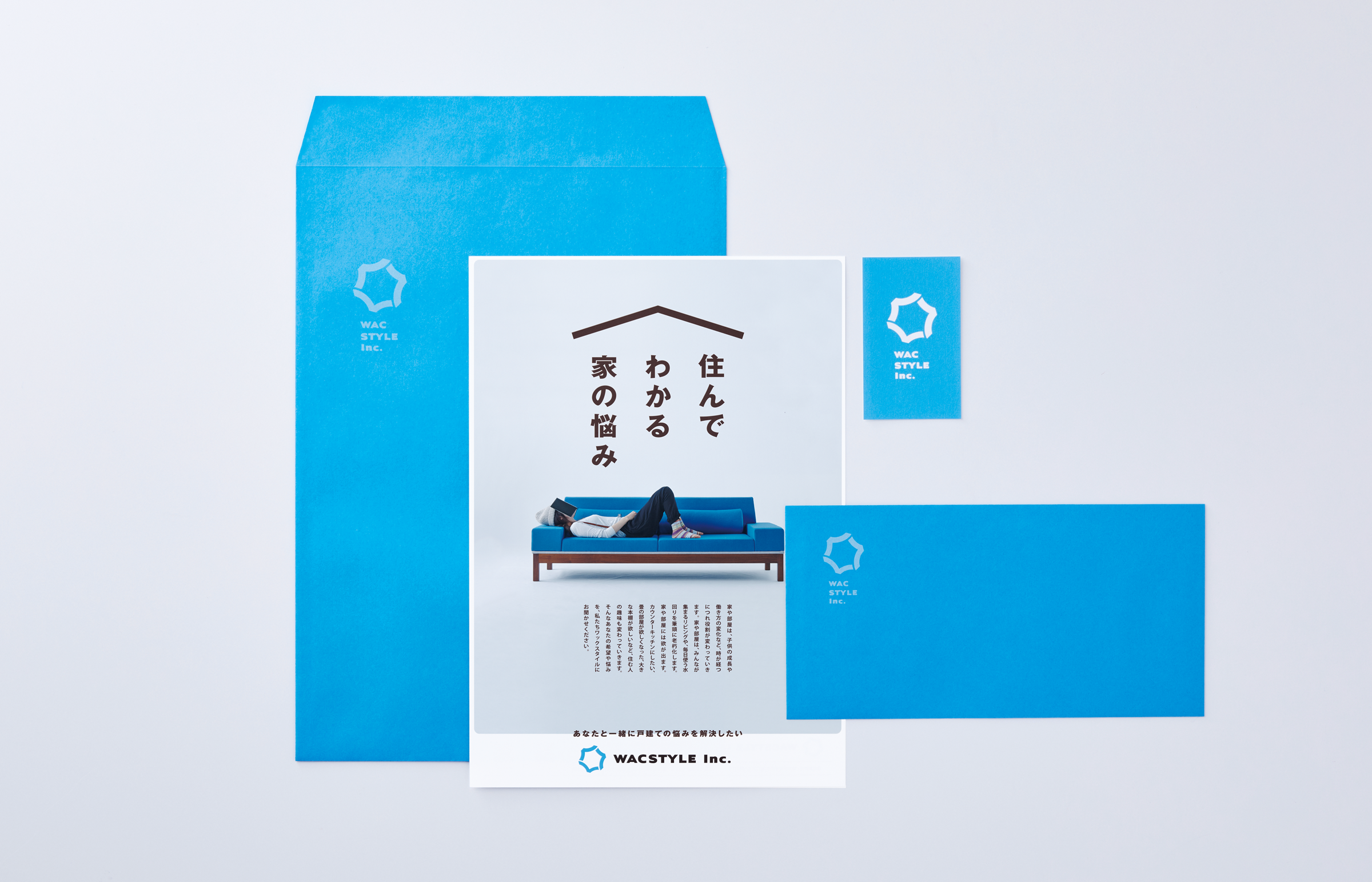
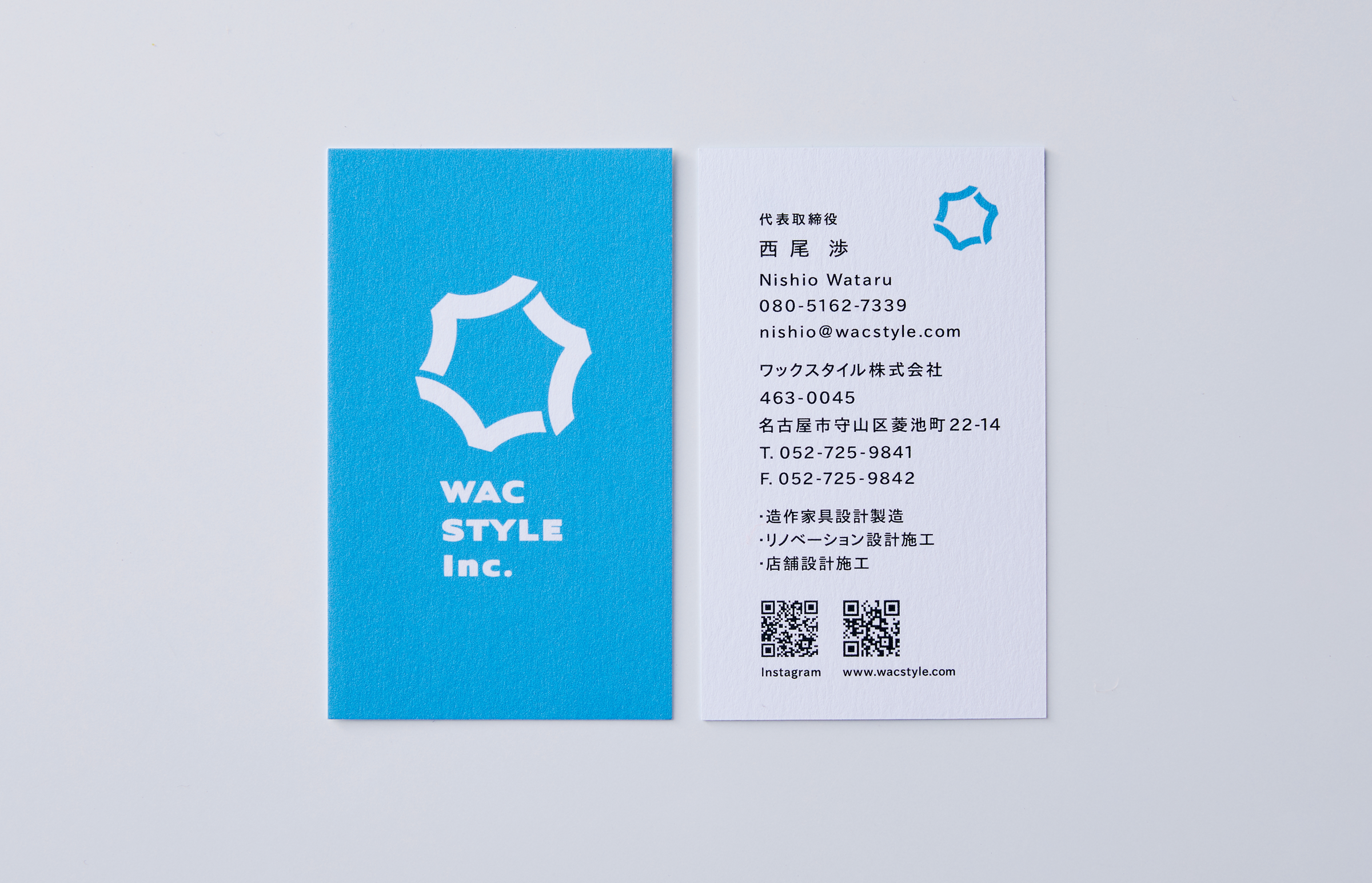
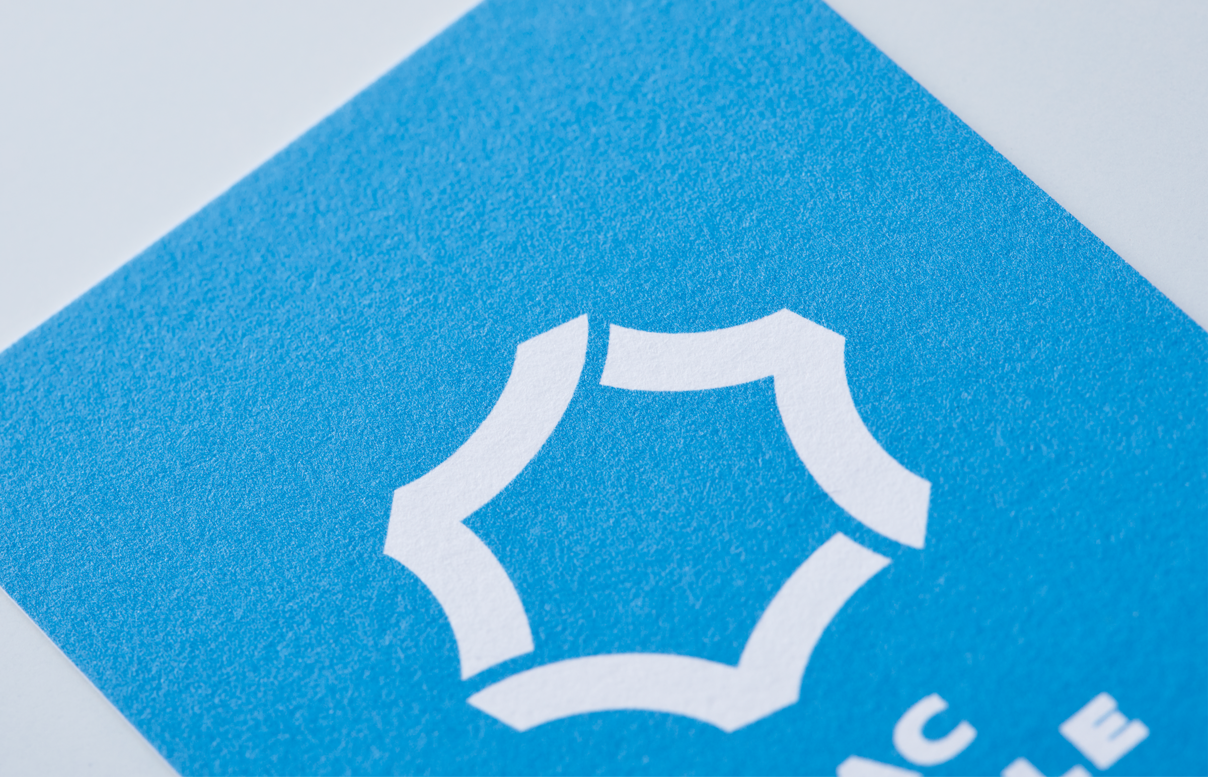
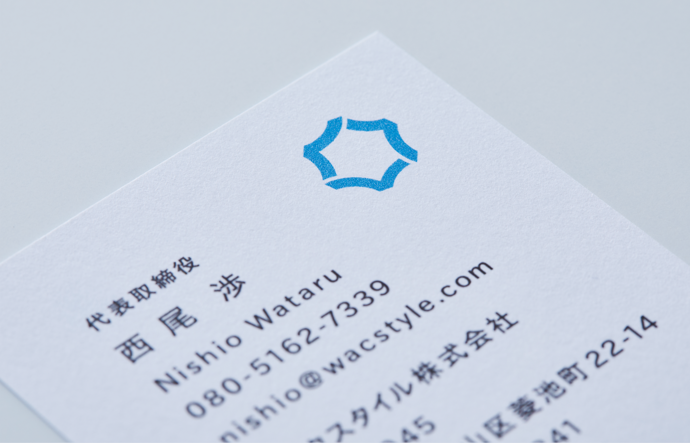
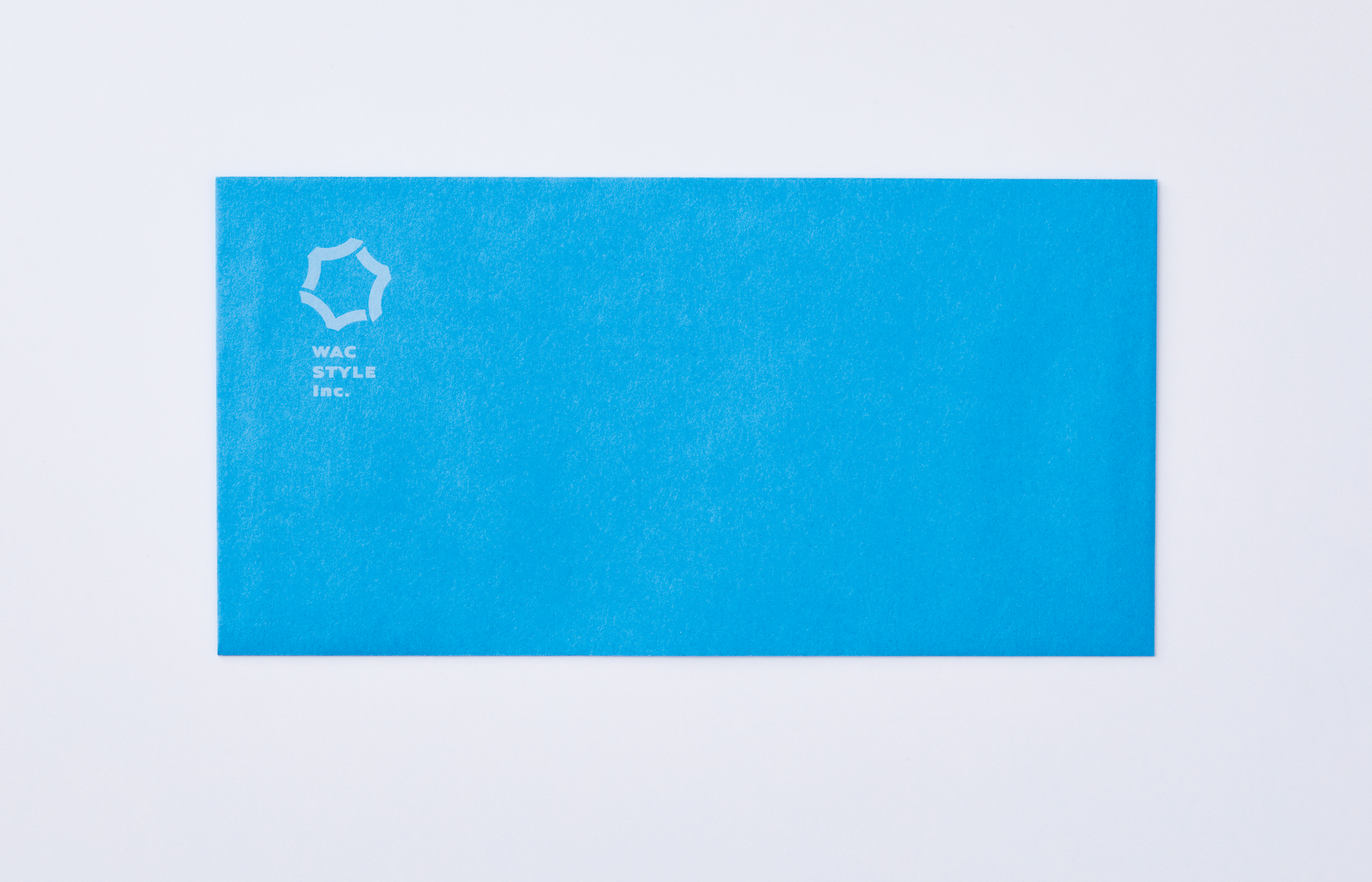
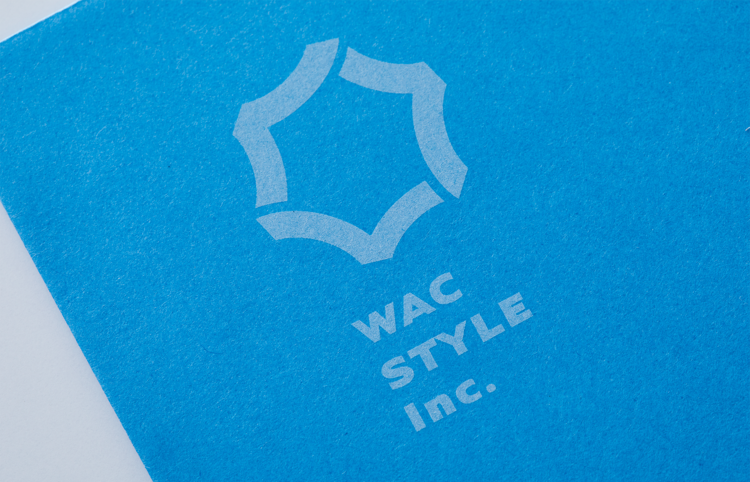
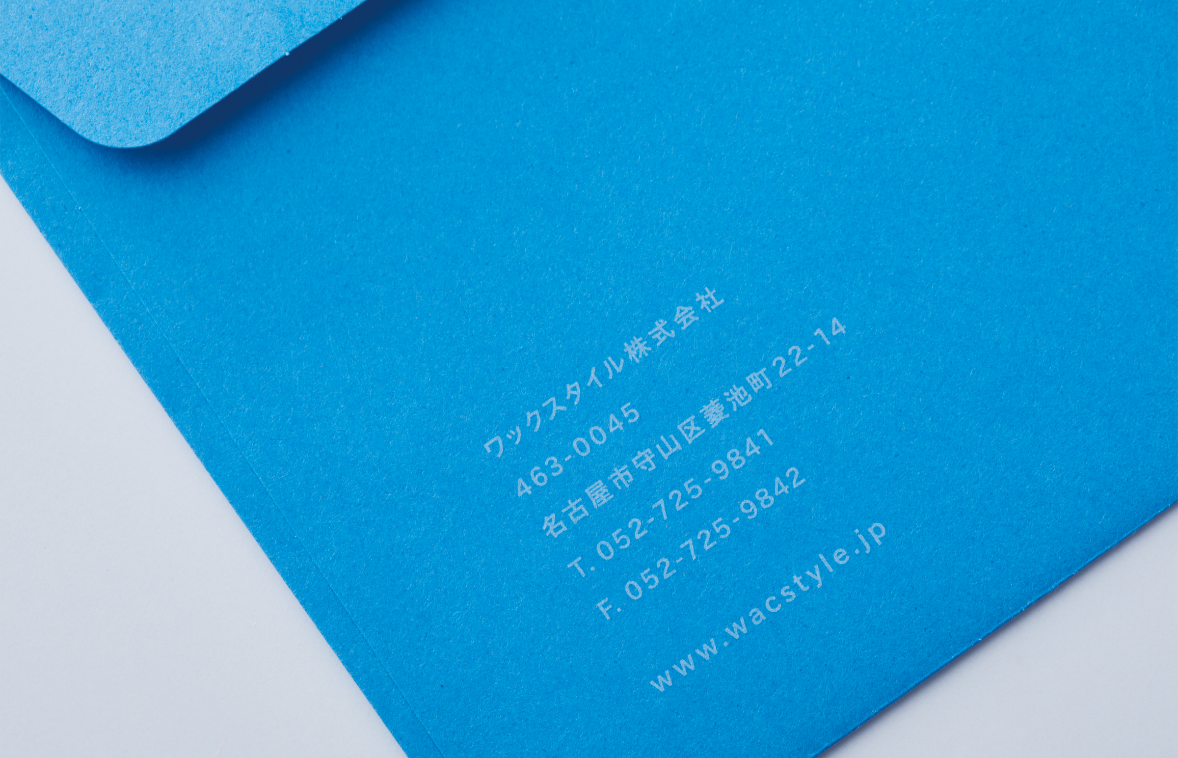
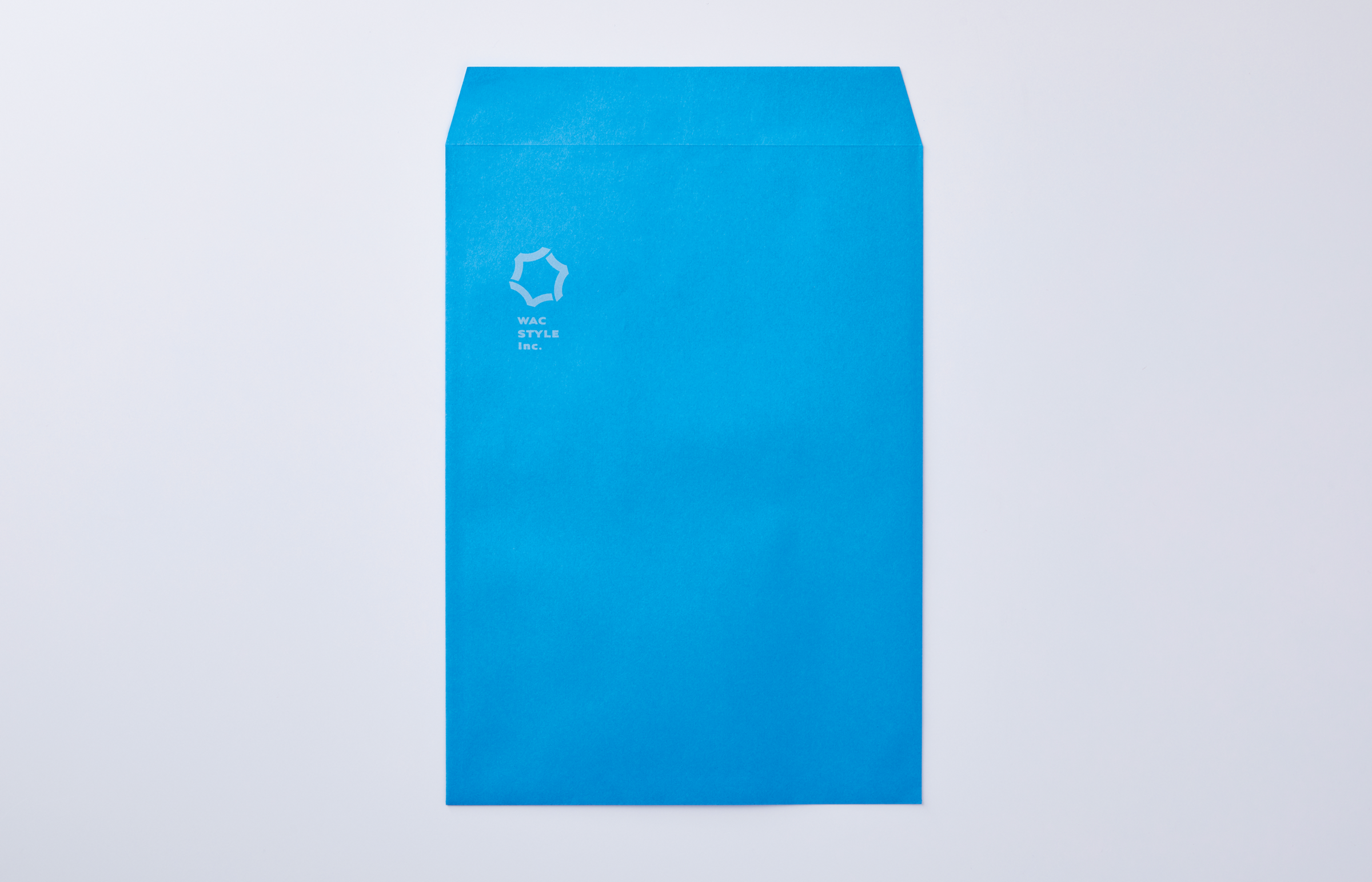
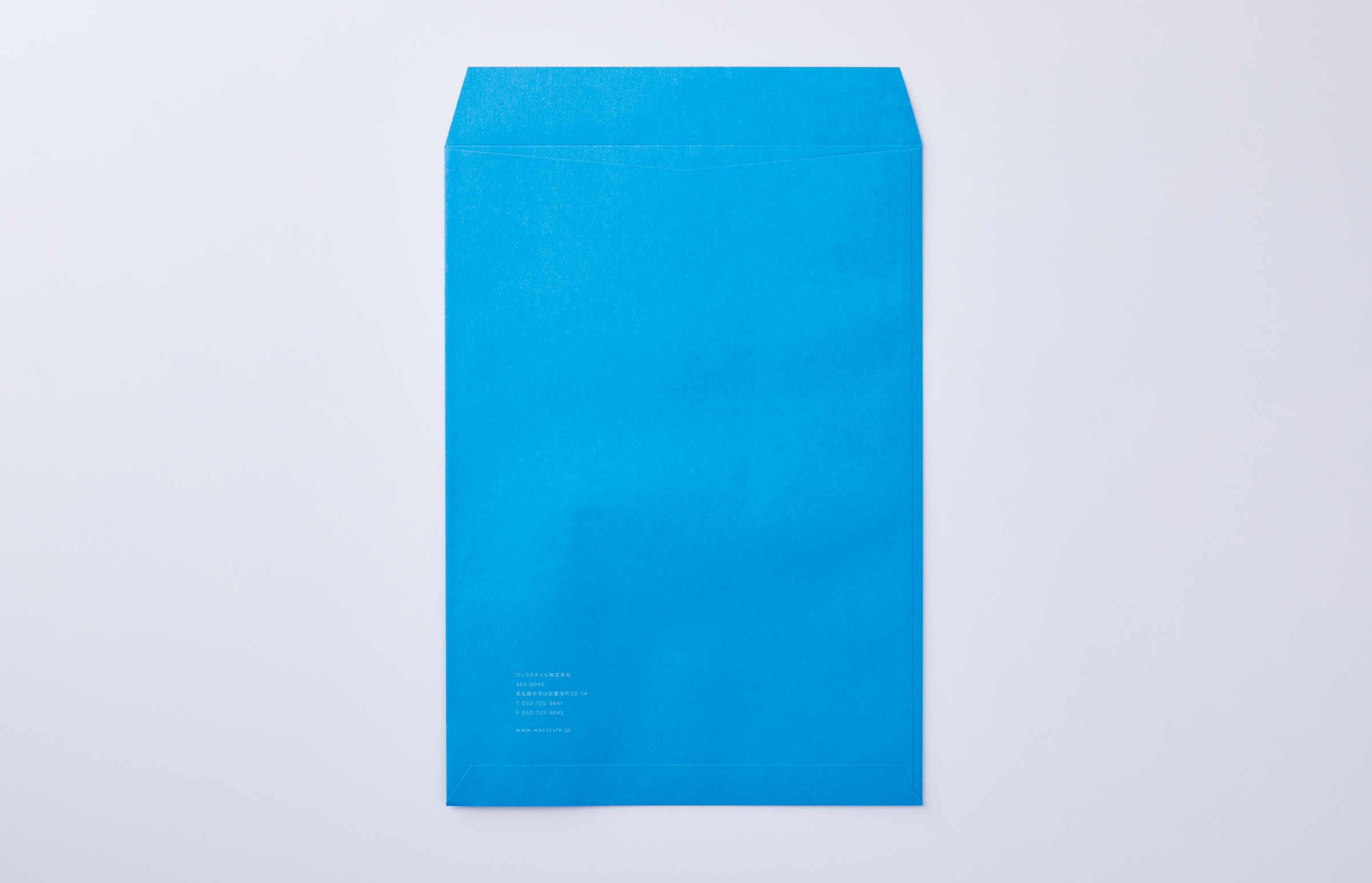
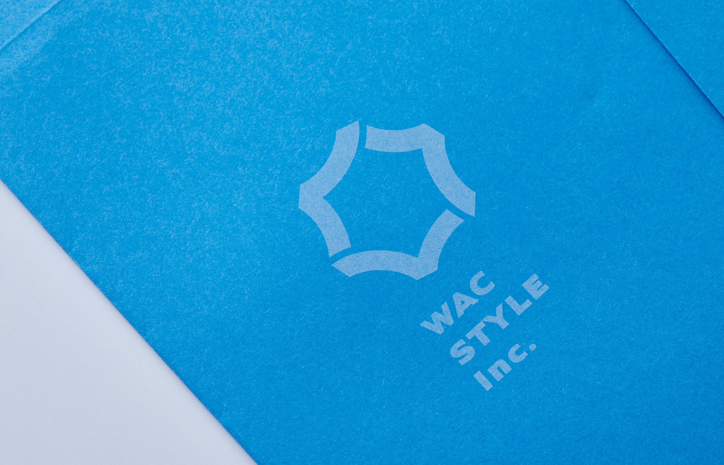
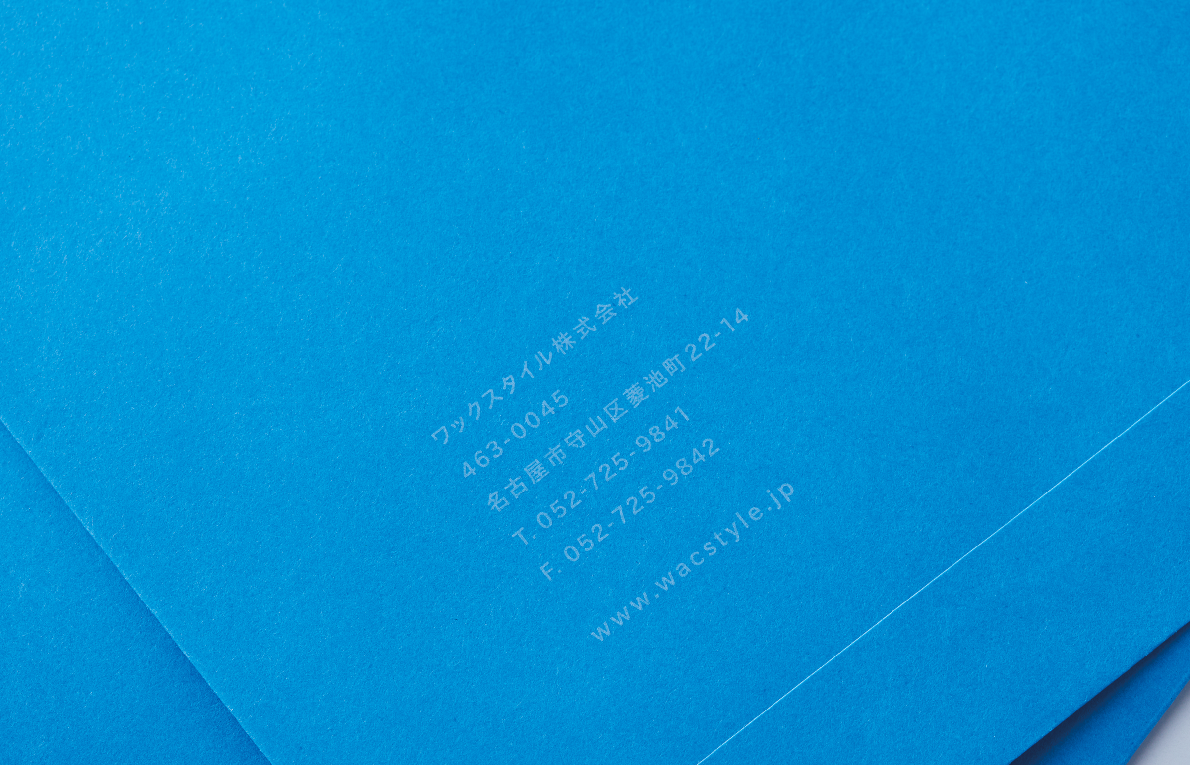
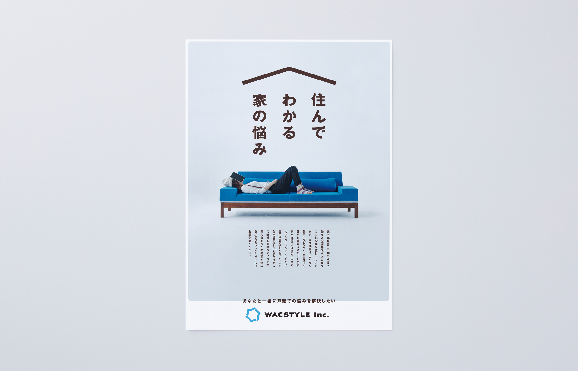
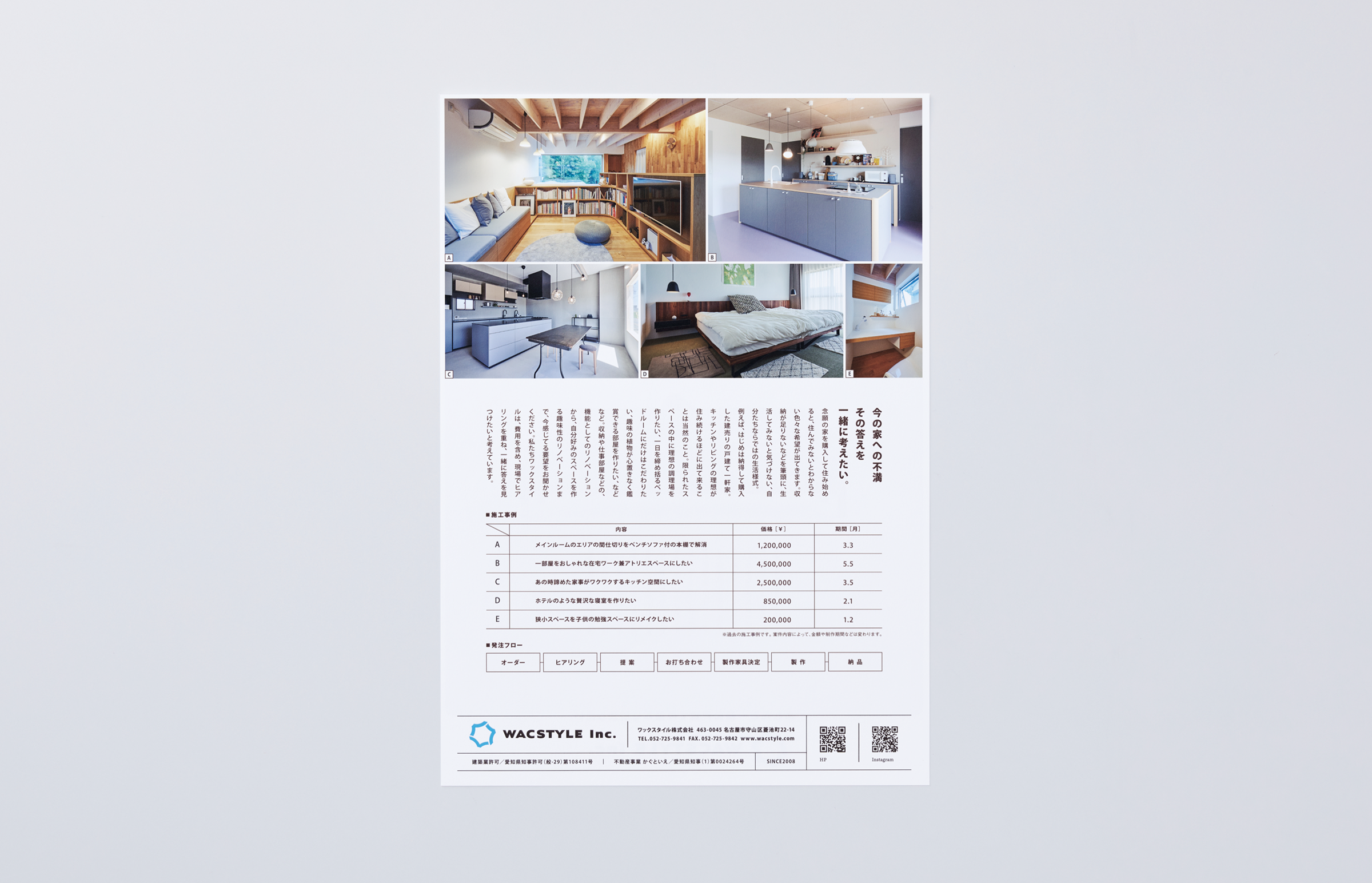
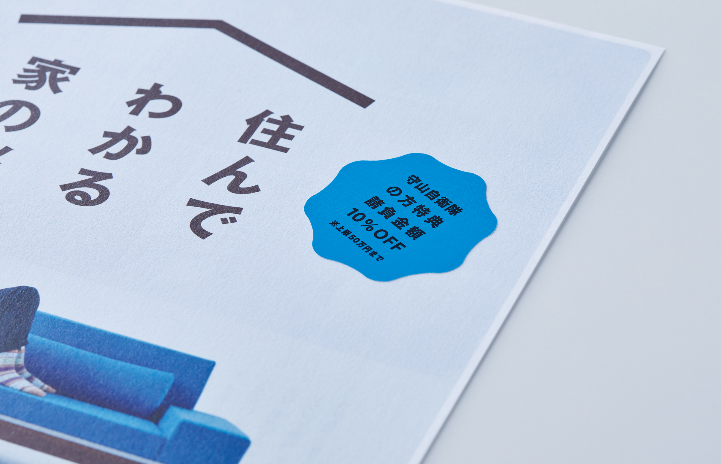
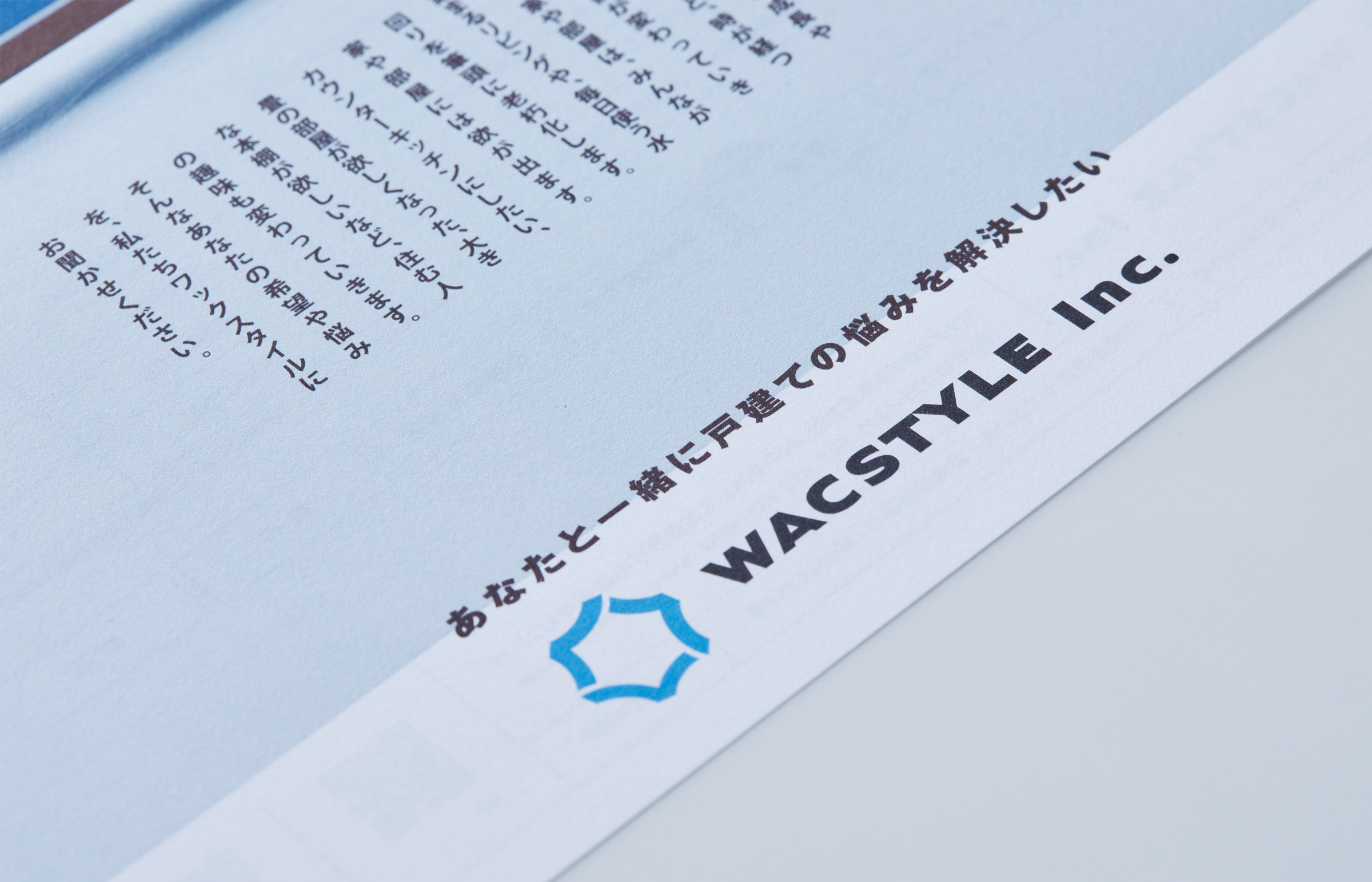
家具製作やリノベーションを行う WACSTYLE のリブランディング。社員数も増え、事業規模も大きくなってきたので、社格を整える時期と判断。企業ロゴのリニューアルから着手しました。木を使った施工が得意な会社であることと、社員数が増えた現況を、木が増えていく森にたとえて、木々の間から明日の空を望む景色をサイン化。アットホームな社風から、気取らず親和性の高いロゴタイプを組み合わせロゴマークとしました。CIカラーはスカイブルーを設定、同色の紙で基本ツールを制作しています。
Art Direction
加藤雅尚
Design
加藤雅尚
Photograph
武藤健二/LUCKIIS